FORM × FEMME
Movement for a stronger you.
A luxury brand identity system for the modern practice of Pilates × Strength. Clean. Classy. Strong. Feminine. Timeless.
The FF Monogram
Two interlocking serif F's — one upright, one inverted — sharing the center axis. Extremely thin lines, bracket serifs, balanced negative space, 180° rotational symmetry. Recognizable at any scale.
Logo Family
Wordmark Variations
The Neutral System
A warm, grounded palette of ivory, sand, taupe, mocha and espresso — with optional terracotta and sage accents. The identity remains neutral. The logo works in espresso, ivory, white, black, and subtle champagne.
The Voice
Aa
ABCDEFGHIJKLMNOPQRSTUVWXYZ
abcdefghijklmnopqrstuvwxyz
0123456789 & × . , ! ?
Aa
ABCDEFGHIJKLMNOPQRSTUVWXYZ
abcdefghijklmnopqrstuvwxyz
0123456789 & × . , ! ?
Brand Lines
Movement for a stronger you.
Primary TaglineStrong is feminine.
Form is how we move. Femme is who we become.
Strength, sculpted with intention.
Pilates precision. Strength by design.
More than a workout. A stronger you.
Move with intention. Become your strongest form.
Discipline creates freedom.
Confidence looks good on you.
A stronger you lives here.
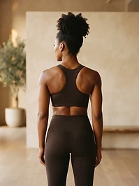
On the Body, In the Studio
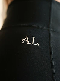
Subtle. Restrained. Confident. The mark earns its place through quality, not volume.
Black Leggings
Cream Leggings
Sports Bra
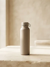
Water Bottle
Gym Bag
Training Journal
Hang Tag
Resistance Band
On Every Ground

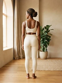
More than a workout. A stronger you.
FORM × FEMME


Discipline creates freedom.
FORM × FEMME